Building a design system as a shared product
I joined as the solo founding designer to build Nucleaton, an autonomous GPU orchestration platform. The product is deep technical infrastructure, and the dashboards had to handle massive amounts of real-time data without breaking or overwhelming the user.
CORE PROBLEM
No time to build a design system from scratch
From the moment I joined the start-up, the CEO expected me to move fast and deliver new dashboards every single day.
A traditional design system built entirely from scratch was not an option under those timelines, but we still needed a single source of truth to prevent the product from fracturing across the app, 5 user roles, and an engineering team spread across three countries.

STRATEGIC ADOPTION
Aligned my design workspace with the engineers
Our engineers were building with React, Tailwind, and HeroUI. To ensure zero design-to-code friction, I skipped building a system from scratch and duplicated the official HeroUI Figma Kit instead.
This gave me two advantages on day one.
Every component I designed natively matched the functional properties and names of the React code repository, so engineers and I spoke the same vocabulary at handoff. And I skipped weeks of design-to-code mapping work, because I started with a system that

TOKEN ARCHITECTURE
On top of HeroUI, I built a 3-tier token architecture inside Figma variables
-
Brand holds the primitive values: hex codes, pixel sizes, font sizes.
-
Alias is the semantic layer where tokens carry meaning instead of values, so a designer uses "primary action" instead of a hex code.
-
Mapped scopes tokens to specific parts, like "button primary background" or "card danger border."

* Semantic names mean a designer's “primary action” and an engineer's btn-primary point to the exact same value. Change it once, it updates everywhere, in design and in code.
HAND-OFF
Organized brand variables to map to HeroUI's custom JSON theme object
I connected our Figma variables to Cursor via the Figma MCP and translated my design tokens into HeroUI-compliant JSON. Then, I handed it to the engineers to drop directly into their config file.

INSIDE CURSOR
How I built token structure inside Cursor
The whole token build runs as a continuous loop between four stages:

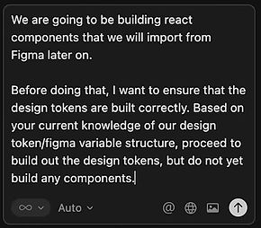
1. I asked Cursor to study the Figma variable structure:
Shared the Figma link and asked Cursor to pay attention to the connection points between the Brand, Alias, and Mapped collections, then generate a summary of the token structure in a .md file.


2. Reviewed the generated .md file with engineering.
Cursor produced a Markdown file documenting the variables of the source. I reviewed it with the engineers to confirm the structure matched their mental model of the code.

3. Requested the next layer of tokens based on the documented structure.
With the .md as context, I asked Cursor to build the next set of tokens, grounded in the structure from step 1 instead of guessing from screenshots.
4. Built the initial design system components in React.
Cursor-generated component code in React, with tokens flowing from Figma to JSON to code in one direction. The engineers reviewed and adopted.
Cursor promt

JSON file handed to dev


MAINTENANCE
Built a scalable & inspectable layout environment
When I build mockups using our custom system, developers can open Figma Dev Mode, inspect elements and see semantic classes and render our exact brand styles.
GOVERNACE
At solo scale, the architecture was the governance.
I designed the token architecture so that consistency was structural. Every value flowed from Brand to Alias to Mapped, with one name in design and code. Anyone using the system used the names, because no other values existed.