Customer summit website redesign
Process:
Persona, Market analysis
User flow, Wireframes, UI design
Tools:
Sketch App, InVision

Hortonworks rebranded its DataWorks summit and redesigned the website to make it more engaging and easier to navigate

ABOUT HORTONWORKS (merged with Cloudera in 2019)
Hortonworks was a Big Data software company based in Bay Area that developed and supported open-source software designed to manage Big Data and associated processing

ABOUT DATAWORKS SUMMIT
DataWorks, a premier big data summit powered by Hortonworks, is an event for both business & tech audiences to learn more about the latest in Big data technologies and how they are transforming businesses. Unlike other data conference, all sessions in DataWorks are vetted and selected by the open source community, for the community.
PROBLEM
The existing website did not present a coherent view of all necessary information, making it difficult to navigate and affect the brand image

Important information was spread all over the site without a coherent sitemap or an easy way for the user to navigate and find what they were looking for.
Many pages contained unnecessary or outdated information making it furthermore confusing.
Users were often frustrated with the website adversely affecting the summit's and company's brand image.
SOLUTION
A complete rebranding of the summit and redesign of the website will serve to engage users better and improve the overall user experience
The website redesign was a critical part of the larger rebranding effort. The primary objective was to create a visually appealing website that provided a clear snapshot of important information about the summit.
We focused on attracting and engaging prospects, re-engaging existing customers, and generating new leads.
By simplifying and reorganizing the information, we created an engaging website that would excite users and improve summit attendance.


“How do we engage and excite the audience about DataWorks and help them see the value in attending the summit?
The website redesign was executed using a scrum delivery model through four 2-week sprints
Duration: 8 weeks
Snapshot of one 2 week sprint

Served as a part of 11 people of Marketings team,
located the Santa Clara, CA
-
VP Marketing
-
Sr. Director
-
Project Manager
-
Back-end Engineers
-
Front-end Engineers
-
Data Architect
-
UX & UI designers
My role
UX and UI design

The common website audience included developers, data scientists, business managers, security professionals, app developers, and data architects
GOAL-DRIVEN PERSONA

Michael Johnson
Product Manager
Age: 50
Experience: 20 years
Degree: MBA
Responsibilities
Develop product strategy & roadmaps, Define release goals and prioritize features, Evangelize and drive adoption of solutions into multiple market segments.
Goals
Personal: Self-improvement, Represent and advertise his company. Expand professional network.
Website: Understand the agenda and focus areas for the summit.
Apply to present a topic or be a keynote speaker

Ajit Kumar
Data Scientist
Age: 40
Experience: 15 years
Degree: PhD in statistics
Responsibilities
Develop statistical / machine learning models for data processing, Work with application developers, machine learning engineers and product managers to prototype model and ensure it is ported into the product.
Goals
Personal: Learn about the latest in Big Data technologies and open source applications, Network with industry peers and pioneers.
Website: Wants information about the upcoming conference in his city along with dates and agenda. Clearly see various ticket purchase options to attend and buy tickets easily.

Rajesh Verma
Software Engineer
Age: 32
Experience: 8 years
Degree: BS in Computer Science
Responsibilities
Design, develop, test, deploy, maintain, and improve software.
Goals
Personal: Self-improvement, learn about the latest technologies and their applications from industry experts.
Website: Wants information about the upcoming conference in his city along with dates and agenda. Clearly see various ticket purchase options to attend and buy tickets easily.
I made a list of common frustrations with the website after interviewing 6 attendees
Website users are looking to find specific information quickly and not linger unnecessarily
-
"The current website is complex and contains a lot of unnecessary information"
-
"Cannot find information easily"
-
"Frustrated spending time on the website to find simple things"
-
"I am confused by all the past event labels".
-
"There is no easy way to share the event on social media"

Michael Johnson
Senior Director,
Product Management
Age: 50
Experience: 20 years
Degree: MBA
Responsibilities
Develop mid to long term product strategy & roadmaps including technology platform strategy.
Goals
Personal: Self-improvement & expand the professional network.
He likes to represent and advertise the company he works at.
Website-related: Wants to understand all details about the tech summits happening in the upcoming year. Submit an application to speak at the event and keynote

Rajesh Verma
Data Scientist
Age: 40
Experience: 15 years
Degree: PhD in statistics
Responsibilities
Developing data infrastructure that ingests and transforms data from different sources and customers at scale.
Goals
Personal: He likes learn about the latest developments, while networking with industry peers and pioneers to learn how to apply open source technology.
Website-related: Wants to find out when the next tech conference will be in his area so he can buy a day pass to attend the event.

Ajit Kumar
Software Engineer
Age: 32
Experience: 8 years
Degree: BS degree in Computer Science
Responsibilities
Design, develop, test, deploy, maintain, and improve software.
Goals
Personal: He is looking forward to self-improvement. Learn solutions from other skilled professionals.
Website-related: Wants to find quickly when the next tech conference will be in his area.
MARKET RESEARCH
I analyzed 3 conference websites with similar features to gather ideas on user expectations

AI Expo
is an artificial intelligence & Big Data expo providing an opportunity to explore and discover implementation of AI & Big Data
TNW
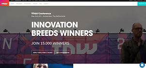
is a website and annual series of conferences focused on new technology and start-up companies in Europe.

Web Summit
is an annual technology conference held in Lisbon, Portugal, considered the largest tech event in the world.
I've examined various elements on these event websites and understand what communicates the event experience


Based on our interviews with DataWorks attendees and analysis of other event sites, I listed in order the most important pieces of information that the website user is looking for
1. Date of the event
2. Time of the event
3. Location
4. Reservation/ Call to action
5. Event description
6. Speakers info
CARD SORTING
Through card sorting, we identified the necessary content for the site and a clear structure to present it

The card sorting exercise is aimed to make easier for people to find details of the specific event.
INFORMATIONAL ARCHITECTURE
The new sitemap consolidated information in fewer main menus and presented a clearer location-centric view
Goals
-
Present a clear map for navigation that is simple and intuitive for the user
-
Eliminate unnecessary pages from the existing website
-
Foresee user needs and actions, and create an easy flow to accommodate them

WIREFRAME
Through wireframes, I presented components that will be used on some of the main pages, such as the home and location pages, the blog, the speaker profile, and the abstract.
Our conference website should provide visitors with a tour of the conference locations, like travel and accommodation info, a map to your conference venue, plus any other information delegates will need to make the most of their trip.
Home page
Sections description

STYLE GUIDE
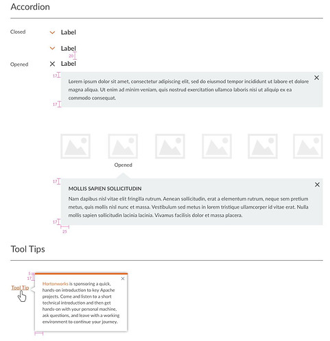
I redefined the style guide & created a component library in Sketch and Invision




A/B TESTING
We tested the home page navigations & past summits sections with twelve people from Hortonworks marketing teams
The website was launched with options 1.
But after testing with end-users, it was replaced with options 2 as more users preferred them
Main & secondary nav and upcoming events info sections
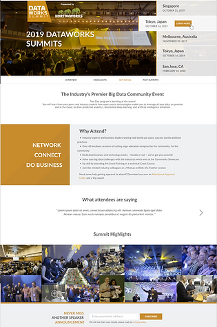
1. Light background

2. Dark background

The dark version was selected after website was redesigned
Past Summits" sections
1. Four columns
Images smaller in size, video replay button appears on hover, location & date displayed outside the event image

2. Three columns
Images bigger in size, video replay button displayed on each event image, location & date displayed is on the event image

Developed after the website lunch
COLOR BLINDNESS TEST
We tested color and contrast to make sure the website could cater to color-blind users
Protanomaly - abnormal red cone photopigments. It makes red, orange appears greener and other colors less bright (1 % of male and 0.01 % female )
Deuteranomaly – red-green color blindness (male population: 5%)
Tritanopia - blue-yellow color blindness. Blue looks like green, and yellow looks violet or light gray. (1% male and female)


Achromatopsia is complete color blindness, due to loss of function of retinal cone photoreceptors. (1 of 30,000 people)

Protanopia - only blue and green cones are functional (1% of Caucasian males)

FINAL DESIGN
I delivered the final UI design using Sketch and InVision for use by the development team
Before redesign
Home page

After redesign
Home page
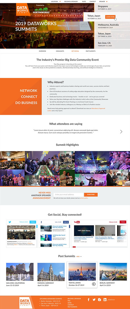
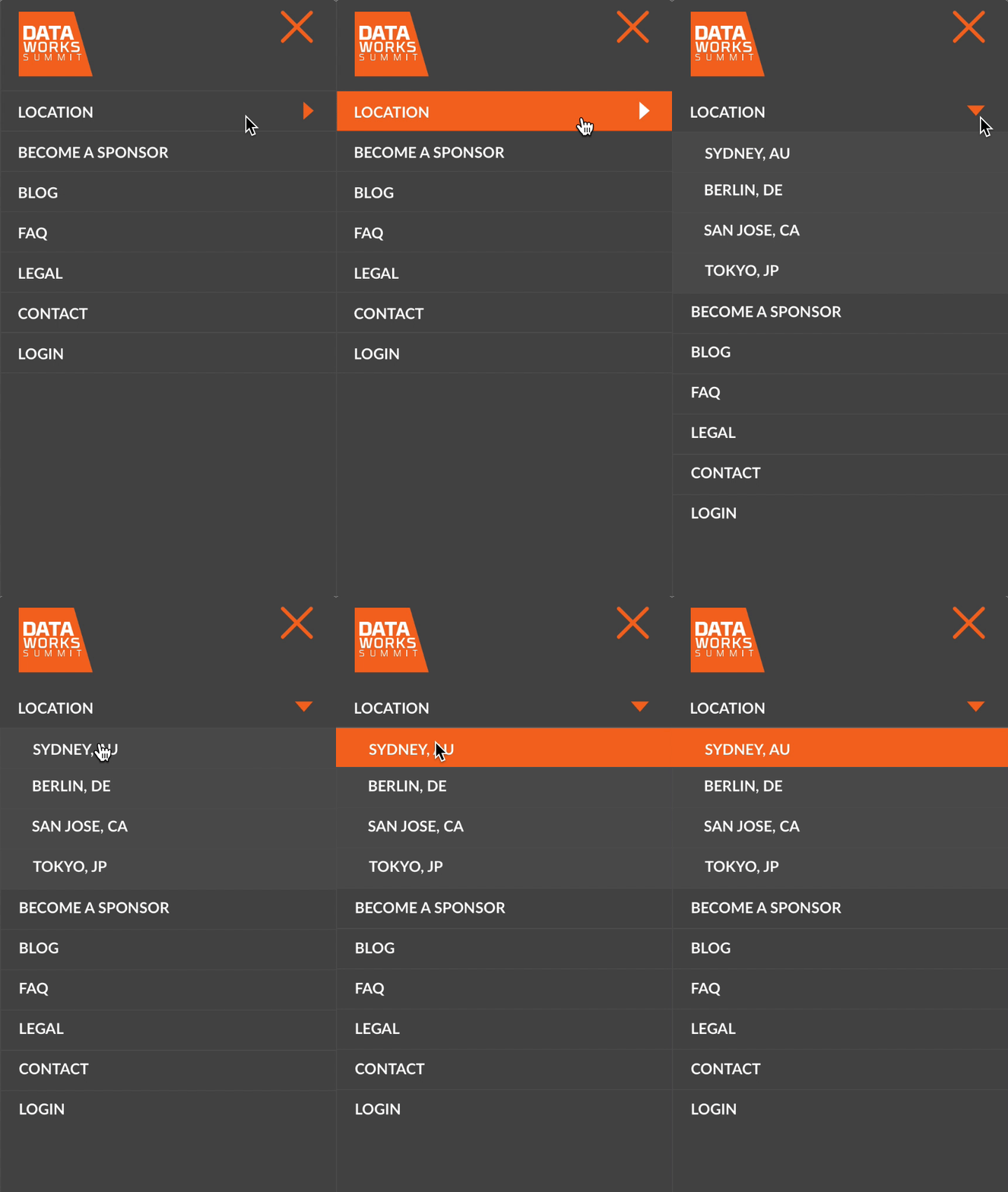
The main nav was simplified and the most information is organized by a location

Before redesign
Mobile nav

Desktop view - Home page
After redesign
Mobile nav
Description
Location page
Mobile view

Blog home and a single article pages contain sections:
Blog - home
-
Header with title
-
About Data works summit
-
All articles tiles
-
Email subscription
-
Social networks
Blog - a single article
-
Header with title and "register", "sponsor", "attendance"pages.
-
Ad of the next upcoming summit
-
Article
-
About the author
-
Leave a comment & comments
-
"You may also like..." - articles tiles
-
Email subscription
-
Social networks
Abstracts guidelines page sections:
-
Header w/title
-
Overview
-
Tracks
-
Required info
-
Selection criteria for abstracts
-
Important dates

OUTCOMES
Intuitive navigation and seamless process that increased registration by 37%
Website bounce rate dropped by 30% and traffic increased by 46% with a high volume of return visits.
Social media engagement improved by over 40% and the site generated over 6 times the number of new leads as the previous one.
LESSONS LEARNED
Easy access to users is a critical factor in delivering quality design
Since a lot of the summit attendees were Hortonworks employees, there was easy access to and sufficient input from the users which made it possible to refine and improve the design through iterations and deliver a quality product.

