


Cluster management application to optimize AI infrastructure utilization
DELIVERABLES
-
End-to-end Product Strategy
-
Multi-role System Architecture
-
Cross-platform Component Library
-
High-density Data Visualizations
ROLE & STATUS
-
Designed full workflow and UI, from cluster setup to live monitoring.
-
March 2025 - May 2026
-
In production, the first paying client was onboarded.
TEAM & LEADERSHIP
-
Solo Product Design Lead
-
Managed design-to-eng handoff for a multinational team (US, UK, RO)
-
Direct collaborator with CEO/Founders
TOOLS
-
Figma
-
FigJam
-
Claude AI, Claude Design
-
Gemini
-
Audio recording
Turning raw infrastructure data into clear and usable interfaces
PROBLEM
The product's technical backend involves complex data streams, including GPU orchestration, multi-role RBAC (role-based access control), identity management, and cluster allocation. This data can easily become confusing and overwhelming for the customers.
SOLUTION
My job was to parse that data into clear interfaces so that clients could stay in control without getting lost in the underlying complexity.
CLIENTS
Focus on three customer types
The company sells to AI startups, data centers, and enterprises. Each one has a different reason to buy:

AI COMPANIES
Scale fast without hiring a DevOps team.

DATA CENTERS
Monetize their idle GPUs.

ENTERPRISES
Data & security keys to stay inside their own infrastructure
DESIGN CHALLENGE
No competitor to copy. No shared language with the team
3 things made this hard:
I could not study a competitor and adapt.
There was no product that runs training and inference on the same GPU cluster. I had to design a complete custom user experience from scratch while the engineering team was still developing the underlying technology.
1
A team fluent in technical language.
The engineers came from CERN, NVIDIA, and AWS SageMaker HyperPod. They expected me to understand complex infrastructure concepts on day one. I had to translate their language into something a product user would understand, without any background on this subject.
2
The CEO had a vision, but the engineers could not see the whole picture.
They could not answer many of my questions until they saw a design. So I flipped the process: I asked the right questions, made 2 to 3 visual mockups for each option, and used the mockups to pull decisions out of the team.
3

WORKSHOPS
Running design thinking workshops to align the CEO and engineers on what to build.
Mapping the high-level product idea on the whiteboard.
I recorded the sessions and used Claude and Gemini to turn the transcripts into a product vision document, with engineering guardrails and success metrics.
We walked out of those sessions with a clear vision, a list of priorities, and agreement on what to build first, and they set the foundation for the multi-role flows that followed.
PERSONAS
Five roles, discovered one screen at a time.
We started with two roles: Super Admin and Cluster Admin. I designed the onboarding flow and the cluster setup screens for them first.
As the product grew, three more roles surfaced: Cluster Nodes Sudoer, IdM User and Project Admin, and Endpoint Manager.
1
Super Admin
The full setup. first sign-in, first cluster, first users.
2
Cluster Controllers Admin
Fast access to cluster head nodes and accounting nodes.
3
Cluster Nodes Sudoer
Deep node-level access for fixing problems.
4
IdM User and Project Admin
User and team management.
5
Endpoint Manager
API endpoints. No cluster-level access.

USER FLOWS
Mapping the user flow of Super and Cluster Admin.
I mapped the end-to-end journey for the two highest-priority roles first, Super Admin and Cluster Admin, building the flows in FigJam with Claude alongside to spot gaps in the journey before engineering caught them. As the product grew, I expanded to cover the other three roles.
Problems to solve for the first release:
-
Setting up GPU cluster (network, storage, login nodes, identity, and security)
-
Full-lifecycle Cluster Management
-
Inference Management and scaling
-
End-to-end Observability and health monitoring

INFORMATION ARCHITECTURE
Role-based navigation, built page by page
The IA grew step by step inside FigJam, and once the structure was clear, I separated navigation by role. Two things stand out here.
1. The onboarding gate: a Super Admin must finish the 5-step cluster setup before the rest of the product opens up, and the left navigation stays locked until setup is complete.
2. Selling the IA itself. This was the CEO's first time working with a designer, so he saw the value only once the map was filled in.
From that point on, the IA became the shared reference for design, engineering, and leadership.

WIREFRAMES
Using mid-fidelity mockups to reduce technical risk

I chose mid-fidelity wireframes with approximate content because our data requirements were already defined, allowing me to fast-track structural testing and layout validation.
For each screen, I made two to three versions and walked the team through them. This gave engineers a clear target and the CEO a way to see the product before it was built.
I used Claude to explore structural directions fast, then moved the strongest layout into Figma for refinement.


VUSUAL DIRECTION
From mood board to a working palette.
For UI, I collected the dashboards engineers usually use day-to-day, and what I noticed was dark backgrounds, sparse color, and line charts.
That mood board led to three decisions:
-
Dark by default.
-
Color matched to Tailwind and HeroUI palettes so designers and developers use the same values.
-
60-30-10 split with dark gray as base, mid-gray for structure, and blue for active states and key metrics.
HIGH-FIDELITY MOCKUPS
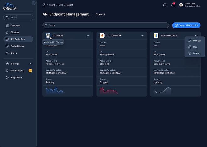
A quick app tour before we dive deeper
Each tab below is a different screen from the app. 👇 To explore visual directions fast, I used Claude and Figma Make for early structural variations, then refined and built the production screens in Figma using my custom variable system.

Cluster Health a live data at the glance.
Four panels show endpoint load, recent jobs, hardware usage, and how cluster time is split between training, inference, and idle time.
It answers the questions an admin asks first:
-
Are endpoints holding up?
-
Did jobs fail?
-
Is hardware used well?
-
Is the cluster earning its cost?
_edited.jpg)




HIGH-FIDELITY MOCKUPS
Now, let's look into how a few design problems were solved
1
Help admins track GPU usage by user and project for any time range
REPORTS Users & Projects
PROBLEM
-
Positioning filters on the right side gives the secondary priority
-
Hard to tell which tab is selected
-
Tabs hid content that the screen had room to show
-
Show/ Hide details buttons are taking over the screen
-
Nesting issue: Not clear which project or user belongs to
-
Repeating labels: "GPU hours."
BEFORE- dev dashboard


AFTER- My redesign


SOLUTION
-
Single toolbar with stats and controls in one row visible at a glance without scrolling or tab switching.
-
Side by side layout for Users and Projects.
-
Card-based row design. Each row is a contained card with hover and selection states.
-
Time range moved into a modal, triggered by the date field, keeping it out of the main view until needed

2
Making chart legend easy to scan
BEFORE- dev dashboard

PROBLEM
-
Once chart data grew, we start experiencing poor legend readability.
-
All identifiers are thrown into a single "cloud," making it nearly impossible for a user to find a specific pair of RX/TX lines.
GOAL
-
Read the labels
-
Match them to chart lines
-
Find a specific line pair quickly.
V1, colored pills with text inside. Fast to recognize, but dark text on light pills fails contrast. Not acceptable for a tool engineers use all day.

V2, solid RX and dotted TX line samples. The legend matches what the chart draws, no mental translation is needed. Text is fully readable.

🏆 My pick: V2. Best mental model, fully readable, nothing hidden by default.
V3 and V4, collapsible versions. Save vertical space, but add a click to the most common task. On a live monitoring tool, speed of recognition beats saving pixels.


View how I built 64-color color variables for plots implementing the “Luminance Staircase” (Accessibility-First Evolution)
3
Making nested projects feel like one system
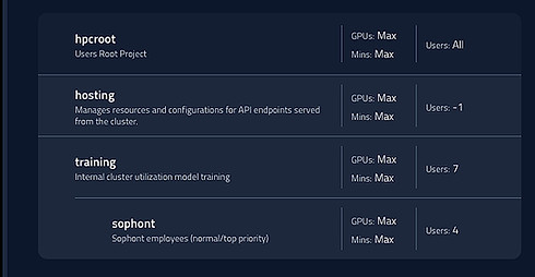
BEFORE (developers version)
PROBLEM
The flat list makes Sophont's customer name look like a separate project. Users cannot see that it is part of training or that it shares GPUs and users.
GOAL
Prove visually that one project is physically and numerically inside another.
AFTER (my redesign)
I explored two patterns: a tree and a nested layout
V1- Tree pattern
Used a tree with connecting lines. The lines suggest hierarchy but the cards still feel like a flat list.
V2 - Nested pattern - The Winner 🏆
Picked because child projects sit visually inside the parent card. Users can see at a glance which project belongs to which.
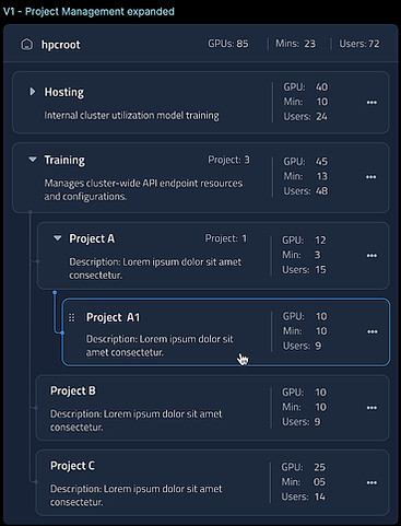

Sticky header shows the current scope (hpcroot / Training). All metrics below belong to this parent.
Hover and active states clearly highlight the selected project.
For the row inside V2 component, I tested 3 card layouts and presented them to the team. We shipped v2 row because the metrics line up vertically, making it easy to compare numbers across many projects.

v1 is the best for dense lists where users scan fast.
v2 is best when comparing numbers across many projects. 🏆
v3 is best when the description is the most important info.

Drag icons only appear on hover. Inspired by Gmail. The card shows actions only when needed. This keeps the component clean even when many projects are listed.

DESIGN SYSTEM
Adopted HeroUI to align design and engineering at the file level
For the design system, I adopted the HeroUI Figma Kit so my component names matched the engineers' React code exactly.
On top of that, I built a 3-tier token architecture: Brand, Alias, and Mapped.
I used Cursor and Claude Desktop to translate Figma variables into HeroUI-compliant JSON, which the engineers dropped straight into their config.
Today, 5 collections (brand, alias, mapped, gradients & opacity, responsive) that are linked directly to code.

IMPACT. LIVE TODAY
$9.2M
First paying client
Healthcare client live in production. 7 months from kickoff.
90%+
GPU Utilization
Designed the dashboards that let admins see and trust the lift from 40% to 90%+.
LESSONS LEARNED
Right decisions made early prevents expensive rework later
01
No build without design review.
Early on, some dashboards shipped before the designs were finalized. Every time it happened, I ended up redesigning live screens, which cost the engineers time and the CEO trust. A simple rule, no ship without review, protected the product, the engineers, and the budget for the rest of the project.
02
Shipping fast and building well can happen together.
I used to think shipping fast meant cutting corners on the design system, but it’s important to set the right foundation first: Adopting the HeroUI Figma Kit with tokens on top let me ship Super Admins Onboarding in week four.
WHAT IS NEXT
Improve the product with real users
-
Observe the client work in production to find friction
-
Read live bug reports to catch design issues that only surface under real data
-
Refine with engineers as real usage exposes gaps
HOW I WOULD IMPROVE THE PRODUCT
WHERE I WOULD TAKE IT NEXT
-
A mobile app to monitor clusters away from desks
-
A light mode for teams where dark is not the default
-
An expanded design system with more components and patterns


